Wednesday, April 29, 2009

Week 15

Assignment- our assignment this week was to actually put out website up using Xythos and iWeb.

Craft- we logged onto x7.sxu.edu to post our website. first, we needed to publish out web pages from iWeb, so once that was completed, we uploaded the files onto our account on Xythos, which allows others to finally see our web pages. 

Composition- if we needed to make adjustments to the website we already posted, we fixed the problems on iWeb, then published it, and erased our old files on Xythos and replaced them with the new and improved web pages.

Concept- the concept of this project was to learn how to create a web site on the SXU server so that other students can see our work and make comments on what we can do to improve.

Monday, April 27, 2009

Week 14 - NEW WEBSITE


To see my new website, click here:


Assignment: our assignment for this week was to do more work with iWeb and complete our website.

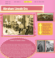
Craft- i took the rough draft i created last week of just my about me and about vc page and expanded upon it.  also, i added other pages of my different projects i have completed throughout the semester, such as the Lincoln era project, our second mash-up project of something we are passionate about, and our comic storyboard project.  with each project which had a different page, i added a paragraph explaining what the project was, how i did it, why i did it, etc.

Composition- we were told we had to change up the layout from the original.  we were supposed to make it look significantly different that how it originally looked so that people wouldn't even know by first glance, which template we used.  i changed mine up by changing the colors, adding shapes and other unique little touches that would make my web pages look different.

Concept- the purpose of this assignment was to become familiarized with iWeb and its an easy way for us to show off our art work to our classmates.

Monday, April 20, 2009

Week 13


Assignment- make a website with 2 pages- a welcome page talking about what visual communications means to us and an about me page where you talk about you.

Craft- use the program, iWeb, on Mac that allows us to create our own website. we were to add pictures and information about us to make the website original and all about us. we were supposed to add pictures of ourselves, along with pictures of the projects we have completed in this course thus far.

Composition- we first created different folders for the different projects weve completed so our artwork would be organized. we then picked a ayout of how we wanted our website to be. next we added the information about us as well as our past projects.

Concept- to express ourselves and through this website and also let people know what visual communications means to us.

Monday, April 13, 2009

Week 12


Assignment- improve our comic by creating and adding dialogue and creating more of a story in the Comic Life program.

Craft- we improved our comic story by adding dialogue so the audience would have a better understanding of what the characters are thinking. we also decorated each page with a background and outlined each picture. we also put several pictures on one page to give it more of a comic book feel. on monday, as a class, we decided on one groups project we felt was the most complete, and they would be done with this project. the other groups still needed to work on some things to complete their projects, taking the classes constructive critisism into account.

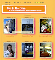
Composition- we stayed with our original color scheme- blue and yellow, but changed our filters to a clearer, more understandable filter. we created a title- bun in the oven- which creates a fun, more upbeat, tone to our story.

Concept- the purpose of using comic life was to put a different twist on our project- make them more than just a series of pictures telling a story. we now have meaning behind those pictures, and comic life helps the story become more complete. using all the tools comic life has to offer, our project has come a long way from what it was on day 1.

Wednesday, April 1, 2009

Week 11

Assignment- our assignment for this week was to take the storyboard we have already created and apply only 2 colors to it.

Craft- the first step we did as a group was split up the photos between the group members. then, we chose blue and yellow as our colors. next, we all desaturated the pictures, made blue the background color and used yellow to make certain parts of the images pop. we each did our pictures differently with different values of the colors and when we brought our work together, we decided on one style we liked so we could keep our project consistant. then we just adjusted some of the other slides.

Composition- it was difficult only being able to use 2 colors to send the right message of each frame. we chose blue and yellow becaue they are opposite the color wheel and work well together, as well as set a good tone for our story. we also thought blue would be a good color because there are so many shades and values of it, we knew we would have a great variety.

Concept- same concept as other weeks, it is just expressed and understood easier because we used only the colors blue and yellow

Wednesday, March 25, 2009

Week 10


Assignment- 9-12 frame storyboard of pictures that tells a story, with one person traveling, another waiting, and one of them giving a present to the other.

Craft- After picking the pictures to use, we needed to decide on a filter we would use for all of our pictures so our project would stay consistant. we decided to use the filter artistic- poster edges, distort- diffuse glow, and for some of our pictures, we thought the edges needed to be more crisp, so we used sharpen- sharpen edges. then, when it came time to decide on colors we chose blue and yellow. we chose blue because there are several different values and hues that we would be able to use, plus it is more of a sad/cold color which fits our story because it is kind of a sad story until the end when the kids are reunited. the other color we chose was yellow. yellow is opposite blue on the color wheel, so is very compatable with blue, plus it is a bright color that will add great contrast to the dark shades of blue we use.

Composition- we believe the pictures we chose to complete our storyboard express our message the best. each picture we picked has a different significance that adds to our story and completes it. when it comes to deciding which group member will complete which part of the final project, my group is pretty good. we split the work up evenly and do approximately the same amount of work. it is good to know that i can count on my group members, though.

Concept- our story is the same as before. a teenage girl gets kicked out of her house by her parents and she has no where to go, so she decides to visit her boyfriend, who happens to be in the marines. she is pregnant, but this information isnt revealed until the last frame. the audience can then assume it is the marine's baby.

Monday, March 23, 2009

Week 9

Assignment- to continue working on our comics as a group

Craft- we finally had all the pictures necessary to complete our project, so then all we needed to do was use photoshop to collage them, enhance them, and use filters to create more of a unique twist to our stories.

Composition- we decided to use the filters artistic ->poster edges, distort -> diffuse glow, and sharpen ->sharpen edges for the majority of our frames. we liked the whole speckled black dots look, so with each frame, we tried something different, but not too different so it would match the theme of our project.

Concept- we decided to use 9 slides because we felt it would be more efficient then dragging the story out for 12 frames.